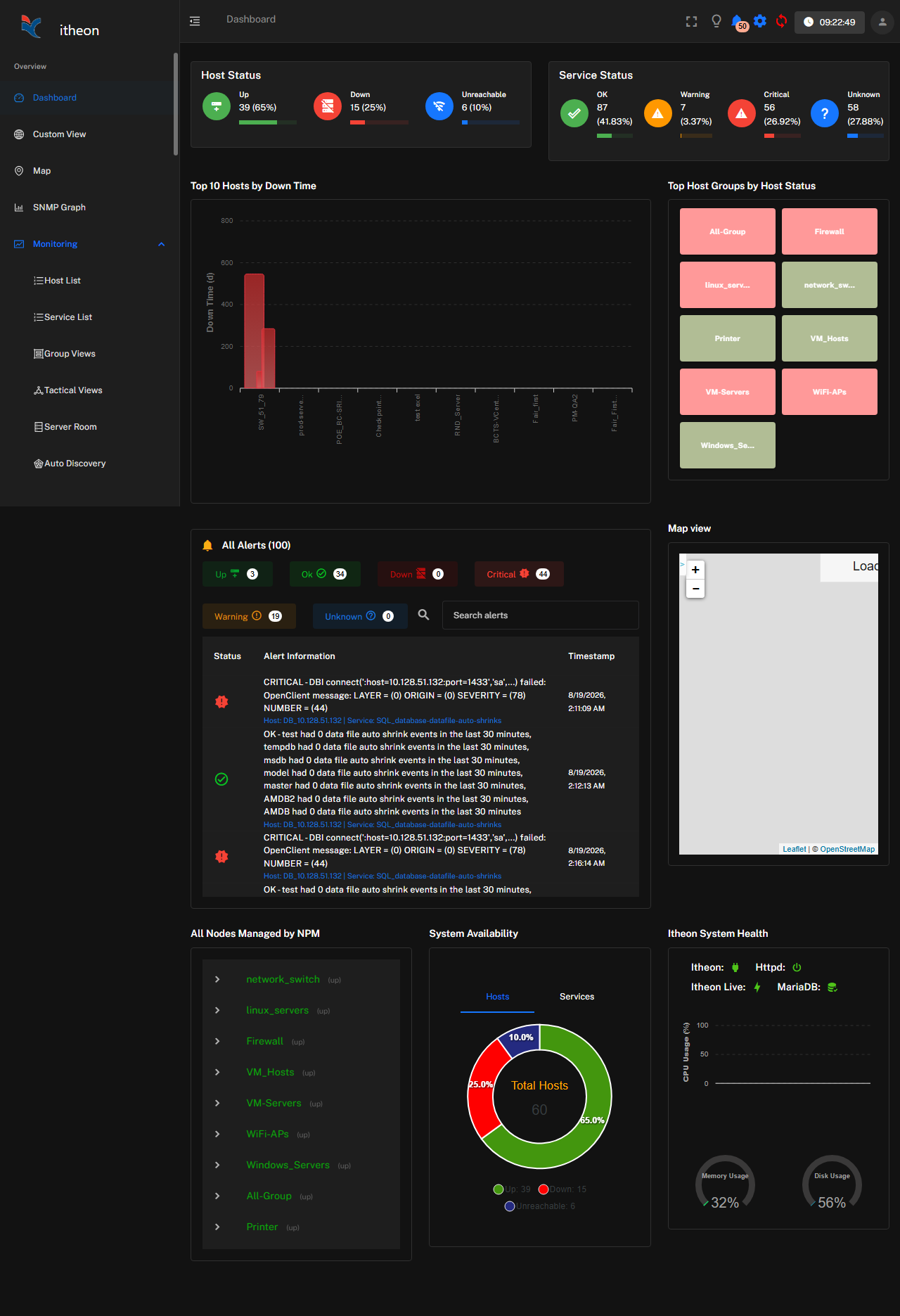
When you log in to iPM, you land on the dashboard, which is the default, real-time view of everything the platform is currently monitoring.
The default dashboard is organized into a few core panels:
- Host status summary — a count of hosts that are Up, Down, or Pending, usually shown as color-coded tiles (green, red, yellow) so problems are visible at a glance.
- Service status summary — the same breakdown, but for individual services (OK, Warning, Critical, Unknown) across all monitored hosts.
- Recent alerts — a live feed of the most recent alerts and status changes, newest first, so you can see what just happened without digging through reports.
- Performance graphs — rolling graphs for key metrics (CPU, memory, network throughput) across your most-watched hosts.
Every panel is clickable. Selecting a host status tile takes you to a filtered list of just those hosts; selecting a host or service takes you to its detail page, with full history, graphs, and configuration.
The dashboard refreshes automatically at a regular interval, so status changes and new alerts appear without you needing to reload the page.
This default dashboard gives every user a sensible starting view, but it isn't the only view available:
- Widgets explains the individual building blocks a dashboard is made of
- Custom Dashboards covers building your own layout for a specific team, site, or role
- Dashboard Filters covers scoping any dashboard down to what matters to you (a host group, a site, a time range)
If you only ever use one screen in iPM day to day, it's this one, so it's worth getting familiar with it early.